
Paper Sorcerer is a fantasy RPG in the JRPG style developed by Jesse Gallagher and published by Ultra Runway Games. It was successfully Kickstarted and subsequently released some time ago, but the question that always comes up with Kickstarter projects: is it any good, or was it just an attempt to cash in? Well, lets examine a little deeper and find out.
Mechanically, the game is pretty much bog-standard JRPG
but those mechanics are implemented mostly pretty well
It's actually a game that has a very specific formula with spells that adhere to certain tropes and very specific mechanics for a reason, because when games have tried to go against that formula they usually do so without an understanding of how to balance such and as a result tend to be a mess. Paper Sorcerer does this quite well, actually, having a variety of fairly original mechanics, skills, and spells along with the more commonplace ones that all seem fairly well-balanced. I really liked the variety of the skills and I had available to me, and they were given at a good pace. The only thing missing, though its a notable absence, is the ability to flee from combats. Once you're in combat you're committed, and since you have random encounters, that can be rather frustrating when the game dumps a hard encounter on you that you're not in the state to handle.
The enemies have plenty of variety too, and while the generic enemies are just that, generic, each of the bosses had their own little lore and back story, communicated both in side rumours and lore, but also in the conversations you'll have with them before and after battle. There's plenty of touches of fluff lore even for the mooks, however, all kinds of little details like journals, their belongings and such.
Enemies on the overworld were thus disappointing
With such details given to fleshing out even those minor enemies it seems a little dissonant that the only indication of an enemy on the overworld map is an amorphous black blob. It seems like a concession to the fact that the game overworld is full 3D rather than the 2D of the battle screen, but there's many ways the game could have gotten around this which frankly would have felt "better" to me that I can't really give that a pass. I would have been happier even with the always-forward sprites of the "3D" of Doom/Doom 2 than those amorphous masses, to say nothing of how having full-3D character models with the same kind of wonderful textures that the gameworld has would have looked.
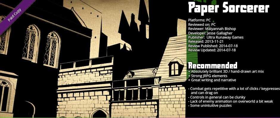
The game art - particularly on the overworld - looks brilliant
That really is the clincher in that strange juxtaposition - the actual world art looks absolutely brilliant, consisting of hand-drawn art that is then textured over a full-3D overworld. The way the lighting is done sharply and the general level of detail again lavished on that part of the game as well ends up looking quite stunning. It's really quite neat-looking in my opinion. There are some rough edges - the texture quality gets a little not great up close on larger surfaces since it's stretching a hand-drawn art - and sometimes whatever engine is rendering those shadows leaves some artifacts - but altogether I think it is quite visually distinct and neat - and the former is notable in and of itself. There aren't many other games I can think of that look similar.
Inverting the typical story, the narrative is quite interesting
The game story weaves a tale of you having been previously a powerful sorcerer or sorceress that had a reign of terror over the countryside before being trapped in a magical book, hence the title of the game, and the game world and it's inhabitants I found rather interesting. Not Lord of the Rings-type depth, but interesting nonetheless. It does a decent job of having the gameworld feel like while it does exist for the purpose of imprisoning you and others like you, you're not the only person in there, and until you start making real progress, the guards don't necessarily consider you a unique threat. There's a bit of moral ambiguity that while perhaps predictable for a story having you play a character typically considered the "villain" is done in such a way that feels authentic to the characters involved.
The interface and controls are a bit clunky at times
The interface is lifted pretty much straight from any 90s NES, or later RPG Maker, JRPG ever, and as such it's pretty clunky. It's usually a lot more clicks than it needs to be, but that's a fairly universal complaint for JRPGs in general; it's an antiquated control scheme. A complaint more specific to Paper Sorcerer is that occasionally the mouse would decouple from the middle of the screen which makes looking around extremely difficult. I wasn't able to fix that when it happened short of restarting, so it was a big pain when ti did happen. Thankfully, it only happened a few times in the many hours I played.
The final thing of note are some of the puzzles - most of them are very simple, but there's a couple which are really obtuse and discovering the solution to them was basically doing the adventure game thing of mashing all the different things together until you got results. It's not something which detracted from the game in a big way to me, but it was frustrating nonetheless.


