
Editor's Note: This review was based on review code provided at no additional cost by Meridian4.
Starion Tactics is a casual strategy 4X game developed by Corncrow Games and published by Meridian4. It's probably best thought of in terms of a board game adaptation, though it is not adapting any existing board game to my knowledge. I say that rather because it adapts a lot of design principles from board game design. Indeed, it very much seems like one. It is not necessarily a bad thing, and indeed as someone that plays both board and video games both I found plenty to enjoy in Starion Tactics, but for the price, it feels a little too simple and a little too bland.
The game design is very board-game indeed,
but this makes the game flow kind of choppy in places
The mechanics of Starion Tactics are simple enough that this is going to be a short-form review and leave me with them guilty feelings for it being short-form again, but .. we deal with the cards we get dealt, I suppose. Starion Tactics has four "generals" in each of four races, which each have their own ships with attack and defense ratings. You have a game board constructed of a grid of planets, each with a resource value associated with them which is generated every turn to the player whom controls then. You then buy fleets based upon your resource stockpile, and travel diagonally between the grid to capture the planets. If a planet is contested, then the two fleets will battle, with those ships stats determining the outcome as one might easily predict, although there does seem to be a very small element of RNG involved.
It's not a bad setup, and there's a variety of different vessels to keep things interesting, although the necessity of colony ships seems questionable. Nonetheless, the setup is solid, but if that sounds rather bland and uncomplicated, that's because, well, it is. There's obviously a nuance to the strategy in this game of space checkers, don't get me wrong, but the core mechanics are very simplistic, and that's the front and foremost complaint here. I always struggle somewhat in these kind of cases - a bad game with complex mechanics you can unpack, examine, and debrief as to how they went wrong. However, simple mechanics that work, and don't feel like they're enough, can be much more difficult to criticise, because that feeling of value is subjective.
Starion Tactics seems a classic case study in an over-priced game
This is not a bad game. The mechanics are simple yes, but presented well for the most part (more on that later) and with some flair, the graphics are serviceable except for one peculiar rough edge and by the by the games a modest amount of fun in multi-player.
So why does it feel empty?
Due to expectations, is why. A game that is 20 dollars has different expectations than one that is five, and this is definitely the kind of game I'd pick up for five bucks and not feel to terrible about it, in a "well this is rough around the edges but it's a cheap indie title so I can forgive that" sort of way. When it's 20 dollars - the same amount I recently picked up Mass Effect and Mass Effect 2 on Origin for (originally had them on Steam) - well, expectations are higher. This game doesn't have similar complexity to most other titles that are in its price bracket and therefore feels lacking.
Production values are fairly high, however
And that really is the saving grace here along with the mechanics being solid if workable - the game has a presentation that is fairly solid and well-thought out, presenting everything you need to know with minimal fuss and but a quick glance. Clicking through of multiple screens is kept to a minimum and the graphics look crisp.
Perhaps a little too crisp in places however - in some but not all instances of me running the game resulted in really weird text kerning problems that made the text jagged and hard to read. It was frequent enough not to be a fluke but not often enough to be a significant mark against the game.
The larger problem with the presentation resides in games where you have multiple competing "generals" of the same race, since the colour differentiation is made by race, not the captain. This seems like a huge oversight and indeed we mentioned as much to the developer, but it remains a problem to this day unfortunately.
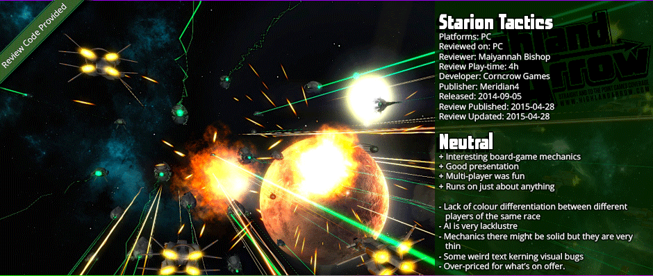
One highlight in the presentation is the combat screens, obviously inspired by Endless Space in how, while they're obviously just plinking symbolically as the numbers have already determined the outcome, make things a little more interesting than simply just tokens win against lesser tokens, and shows off the interesting creative design of the various vessels you can construct.
The campaign AI, in contrast, is pretty dismal
If you, as I do, enjoy these games primarily single-player, you're probably going to be disappointed, as the AI on offer here is approximately as bright as a burnt light bulb and about as useful. It will constantly make blunders, maneuvering in such a way as to leave itself exposed, and often grouping its ships in odd, illogical ways. I pretty much won my first game entirely on the token of the AI sending its few token fighters it started with on a suicide run against my exploring capital ship, leaving it to conquer planets with impunity.
The fun to be had here is definitely in multi-player, and I must confess, it was a fair bit of fun for all its rough edges in multi-player, the problem lies in that primary point I made earlier - I wouldn't really say its "20$ game worth of fun."


